Neumorphism generator.
Make soft UI: an element the color of its background, raised or pressed by a light and a dark shadow drawn from that color. Move the light, shape the surface, copy the CSS.
Neumorphism generator.
Need the UI around it? With Pro, your AI agent builds the form, the result card and the rest of the page from a prompt.
Get ProHow it works
4 steps, no account. It runs in your browser and nothing is uploaded.
Pick the surface color
The element and the page behind it share it; mid-light and mid-dark colors work best.
Choose a shape
Flat, concave or convex for raised elements, pressed for an input or a button that's on.
Place the light
Press a sun in a corner of the preview; distance, blur and intensity set the depth.
Copy the code
CSS that names the background it needs, or Tailwind classes.
Related tools
More CSS generators. Every one free, in the browser.
Pricing
Build it with Pro
The tool is free. Pro adds 6,000+ blocks, premium templates and the MCP server, so your AI editor builds the product around it.
4.9/5 out of 5 · 150+ reviewsfrom 150+ founders and developers.
- Secure checkout via Stripe
- Code lives in your repo
- Keep what you've shipped if you cancel
- License terms
Questions and answers
Before you trust the result: what to know about the format, the limits, your data and the tools next to it.
A style that spread through Dribbble at the end of 2019: elements look pushed out of the page, the same color as the background, with a dark shadow on the side away from the light and a light one on the side facing it. Concave and convex shapes add a gradient to suggest a curved surface.
Both come from the surface color: each RGB channel scaled down by the intensity for the dark shadow and up for the light one, the formula neumorphism.io made the reference. At 15 %, #e0e0e0 gives #bebebe and #ffffff. Shadows in the surface's own hue keep it reading as one material.
Its edges are shadows only a little darker than the page: at the default 15 % the dark shadow is about 1.4:1 against the surface, where WCAG 1.4.11 asks 3:1 for the outline of a control. Buttons can pass for decoration and pressed states are easy to miss, so pair soft UI with labels or icons, a visible focus ring and, where it matters, a border.
Convex shades the surface lighter toward the light, like a dome. Concave does the reverse, like a dish. Pressed turns both shadows inward so the element looks sunk into the page, the usual look for an input or a button that's on.
Yes, on a mid-dark surface such as #3a3f47, where the light shadow becomes a lighter gray. On pure black the dark shadow has nowhere darker to go, and on pure white the light one vanishes, so pick a surface between the two.
Press one of the four suns in the preview's corners. The shadows swap sides and the concave or convex gradient turns to face it: 145deg with the light at the top left, 225deg at the top right, 315deg at the bottom right and 45deg at the bottom left.
The effect only works on a background of exactly the element's color, so the CSS opens with a comment naming it; set that color on the parent.
rounded-[50px] bg-[#e0e0e0] and both shadows in one shadow-[…] class. A curved shape uses bg-linear-145/srgb from-[…] to-[…], so Tailwind blends the gradient in sRGB as the CSS does.
No request carries your input. The Neumorphism generator runs in your browser: nothing you enter is sent anywhere.
No. The Neumorphism generator is free and opens without a sign-in, an account or an install.
Nothing. The Neumorphism generator holds your input in the page's memory, so closing or reloading the tab clears it, and it saves nothing in this browser.
The color picker offers Light gray, Cloud, Sand, Sage, Lilac, Sky, Graphite, and Charcoal. Any color works; mid-light and mid-dark ones leave room for both the darker and the lighter shadow.
Size 40 to 280px with a radius up to half of it, distance 1 to 50px, blur 0 to 100px and intensity 1 to 60 %.
Yes. The line under the preview gives the WCAG ratio between the dark shadow and the surface and says when it falls under the 3:1 a control's outline needs. Only the intensity and the surface color change it.
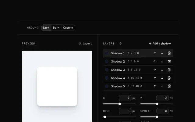
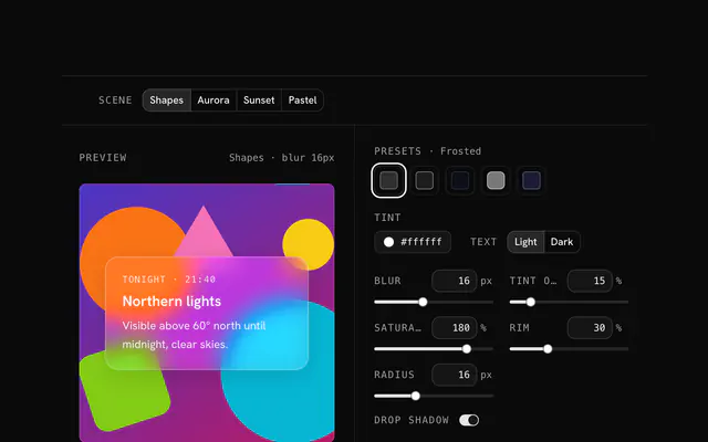
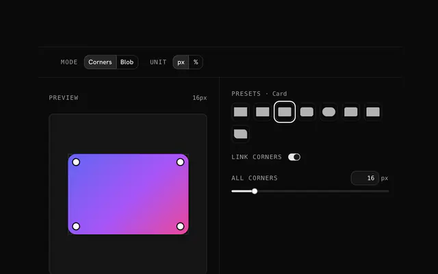
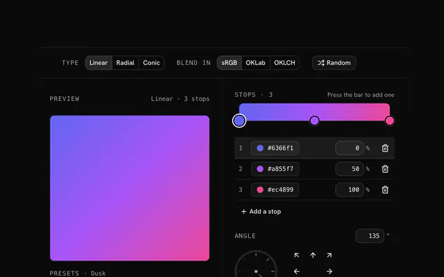
Closest to the Neumorphism generator: Box shadow generator, Glassmorphism generator, Border radius generator, CSS gradient generator. Each opens on its own page, free and in the browser.
The Neumorphism generator is one of 10 in its group. The group's page, /tools/css, lists them all.
The tool is free. Its interface is built from shadcn.io's own components (Button, Input, Slider and the rest of the registry under /ui), which come in React, Vue, Svelte and Solid. Pro adds the blocks and templates for the product around it.
4.9 out of 5 from 150+ developers


Build the product around it
Every block, template and icon, installed by your AI agent in your theme. The tools stay free.
Get Pro