shadcn.io is an independent project built on shadcn/ui
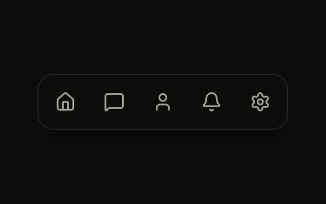
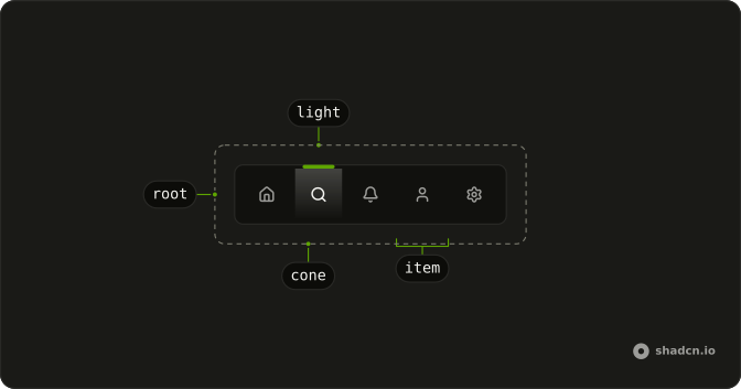
Limelight Nav is a row of icons with a light along its top edge. The light slides over to the item you choose and shines a cone down onto it, while the other icons dim to 40 percent. It suits a short bar of three to six icons, such as an app's main sections or a dashboard's views.
When the items need their names in view, use Menu Dock. For panels that swap in place under the bar, use Tabs.
Installation
Anatomy
Usage
import { HouseIcon, SearchIcon } from "lucide-react";
import {
  LimelightNav, LimelightNavItem,
} from "@/components/ui/limelight-nav";
The nav lights the item whose value matches its defaultValue or value. The light itself is drawn by LimelightNav, so there is no part to add for it.
<LimelightNav aria-label="Main" defaultValue="home">
  <LimelightNavItem aria-label="Home" value="home">
    <HouseIcon aria-hidden="true" />
  </LimelightNavItem>
  <LimelightNavItem aria-label="Search" value="search">
    <SearchIcon aria-hidden="true" />
  </LimelightNavItem>
</LimelightNav>
Accessibility
LimelightNav renders a nav landmark, so give it an aria-label that says which navigation it is, such as Main or Views. Every item is a button, or your link through asChild, with its own place in the tab order, and the arrow keys, Home and End also move between items, skipping disabled ones. Moving focus never moves the light, which waits for Enter, or Space on a button. The lit item gets aria-current, set to page on a link and to true on a button, and an icon-only item needs an aria-label of its own.
- Tab
- Moves focus to the next item, and from the last one out of the nav.
- Shift+Tab
- Moves focus to the previous item, and from the first one out of the nav.
- Arrow Right
- Moves focus to the next item, and from the last one back to the first. In a right-to-left layout, moves to the previous item.
- Arrow Left
- Moves focus to the previous item, and from the first one to the last. In a right-to-left layout, moves to the next item.
- Home
- Moves focus to the first item.
- End
- Moves focus to the last item.
- Enter
- Chooses the focused item and moves the light to it, following the link when the item is one.
- Space
- Chooses the focused item when it is a button. A link ignores it.
Demos
Labels
Home, Explore, Likes and Chats, each an icon over a short word, with Explore lit at first. The bar is taller to fit the words, the word dims and brightens with its icon, and since it names the item there is no aria-label. Pick labels when an icon alone could be misread, like a heart that might mean likes or saved.
Controlled
Four icons for the views List, Map, Photos and Reviews, with Map lit at first and a line under the bar naming the view on show. The view lives in state, goes in as value, and comes back as a plain string from onValueChange. Control the bar when something else on the page depends on the choice.
Links
A site's four pages in a pill-shaped bar, each LimelightNavItem rendering an <a> through asChild, with its href as its value. Docs starts lit, and a click both follows the link and moves the light. In an app, set value from the current route so the light is right after a reload or the back button.
FAQ
When should I use Limelight Nav instead of Menu Dock or Tabs?
Use Limelight Nav for a short row of icons where the chosen one should stand out from across the room, such as the four or five main sections of an app. Its words are optional and dimmed, so the icons have to carry the meaning.
Menu Dock keeps a label under every icon and marks the chosen one with color and a sliding underline. Both are nav landmarks for moving between pages or views. When each choice swaps a panel in place, Tabs gives that panel the tab semantics it needs.
How do I control which Limelight Nav item is lit in React?
Keep the value in state, pass it as value on LimelightNav and update it in onValueChange. The callback receives the chosen item's value as a plain string, so a state setter can go straight in, as in the Controlled demo.
For a starting item you don't need to control, use defaultValue. Leave both out and nothing is lit until someone chooses an item.
How do I use Limelight Nav items as links in React?
Add asChild to each LimelightNavItem and make an <a> or your router's link its only child, with the link's href as the item's value, as the Links demo does.
The lit link gets aria-current="page", which is the right signal for navigation. Set value from the current path rather than defaultValue, so the light lands on the right page after a reload or the back button.
Why is the Limelight Nav light not showing?
The light shows only over an enabled item whose value matches the nav's value or defaultValue. When nothing matches, because of a typo, a route that isn't in the bar, or neither prop set, the light goes out rather than sitting on the wrong item.
A disabled item never takes the light either, even when its value is the current one. If the bar is controlled, check that the callback updates the value you pass back, or a click does nothing visible.
How do I label icon-only Limelight Nav items for screen readers?
Put an aria-label on each LimelightNavItem and aria-hidden on its icon, as the default demo does, so a screen reader reads Home or Search instead of an unnamed button. The lit item also reports aria-current, so the choice is announced as the current one without anyone seeing the light.
With a visible word in the item, as in the Labels demo, the word is the name and the aria-label can go. Name the nav itself too, since a page often has more than one.
How do I change the color or size of the Limelight Nav's light?
The light is drawn in the theme's primary color, so a different --primary changes it everywhere. It's a 44 pixel bar, 5 pixels tall, with a primary shadow 50 pixels below it for the glow and a cone that fades from 30 percent primary to clear.
There is no prop or part for it. Edit the span with data-slot="limelight-nav-light" in components/ui/limelight-nav, which is your code once installed, for another width, color or a softer glow. It stays centered over the lit item whatever the width.
Can I use the Limelight Nav with the keyboard?
Yes. Each item is a button or a link in the tab order, and the arrow keys also move between items, wrapping at the ends and mirrored in a right-to-left layout, with Home and End for the first and last.
Focus shows as a ring inside the item, and the light stays on the chosen item while focus moves. Enter chooses the focused item, and so does Space when the item is a button. The Accessibility section lists every key.
Does the Limelight Nav respect reduced motion?
Yes. When the system asks for reduced motion, the light jumps to the chosen item instead of sliding there over 400 milliseconds, and the icons switch brightness without their short fade. The chosen item is marked the same way, so nothing is lost.
On first render the light lands on its item without sliding in either case, so a page load never shows it sliding in from the left edge.
API Reference
LimelightNav
value?string
The lit item, when controlled.
defaultValue?string
The item lit at first, when uncontrolled.
onValueChange?(value: string) → void
Called with an item's value when it's chosen.
- Parameters
value– string- Returns
void
className?string
Merged with the part's classes.
--limelight-xstring
The light's place, set from the active item.
LimelightNavItem
<button> data-slot="limelight-nav-item"
valuestring
The item's value: the nav's value when it's lit.
asChild?boolean
Use the provided child element as the default rendered element, combining their props and behavior.
className?string
Merged with the part's classes.
data-active?string
Present when active is true.
data-value?string
Mirrors value.
--limelight-xstring
The light's place, set from the active item.