shadcn.io is an independent project built on shadcn/ui
React Aria does not include this primitive, so this page uses the Ark UI component. The visuals match the Ark UI version.
Marquee loops a row of logos, cards or short quotes across its frame, repeating the items so the line never runs out, and holds still while someone points at it. Every version on this site is built on Ark UI's marquee. Reach for it on a marketing page, where the motion is decoration and the items can repeat.
When people need to stop on one item and step to the next, use a Carousel. For a tilted wall of images behind a hero, there is the 3D Marquee.
Installation
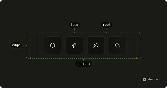
Anatomy
Usage
import {
  Marquee, MarqueeContent, MarqueeItem,
} from "@/components/ui/marquee";
Put one MarqueeItem per logo or card inside MarqueeContent. The marquee makes the copies that close the loop itself, so list each item once.
const logos = [
  { name: "Acme", src: "/logos/acme.svg" },
  { name: "Globex", src: "/logos/globex.svg" },
  { name: "Initech", src: "/logos/initech.svg" },
  { name: "Umbrella", src: "/logos/umbrella.svg" },
];

export const CustomerLogos = () => (
  <Marquee aria-label="Customer logos">
    <MarqueeContent>
      {logos.map((logo) => (
        <MarqueeItem key={logo.name}>
          <img alt={logo.name} className="h-8 w-auto" src={logo.src} />
        </MarqueeItem>
      ))}
    </MarqueeContent>
  </Marquee>
);
Accessibility
Ark UI makes the root a region described as a marquee, with live announcements off, so a screen reader reads the items once instead of following the motion. The copies that close the loop are hidden from screen readers and inert, so each item is read and tabbed to once. The region is named "Marquee content" until you give Marquee an aria-label that says what scrolls, such as "Customer logos". Under reduced motion nothing moves: the copies go, and a row wider than the frame scrolls instead. Hover and focus pause the loop, but a strip with nothing to focus can't be stopped by keyboard, so give one beside text a button that sets paused, like the Pause button demo's.
Demos
Autofill
Eight logo cards at a speed of 100, with autoFill adding copies of the set whenever the frame is wider than one set, so no gap opens before the logos come around again. Each added copy also lengthens one loop, so on a wide screen the row moves slower than 100 pixels a second. Use it whenever one set of items can be narrower than the marquee.
Custom speed
The same logo row at a speed of 10 pixels a second, a fifth of the default 50. A slow strip suits names or short quotes that someone reads as they pass, and a logo wall can run faster. Set the speed on Marquee, and the time each loop takes follows from the width of the row.
Fade
Two rows of logos. The first sets showEdges to false and clips the cards hard at the frame, and the second keeps the default fade and runs the other way with reverse. The fade is a mask on the marquee, so it dissolves into whatever sits behind it: a card, a tinted band or a photo.
Orientation horizontal
The logo row with orientation set to horizontal, which is also what you get with no prop: the cards travel from right to left, and the marquee is as tall as they are. Write the prop out when a vertical marquee shares the page, or when the orientation comes from a variable.
Orientation vertical
With orientation set to vertical, the cards stack in a column 7rem wide and capped at 20rem tall, and travel downward. The cap matters, because a column taller than one set of cards shows a gap at the top as it moves. Use it in a sidebar or beside a hero, and add reverse to send the cards up.
Pause on hover
The logo row with pauseOnInteraction written out, though it is already on by default. The loop holds while the pointer is over it or focus is inside, and starts again once both leave. Keep it on when a logo links somewhere or a name has to be read, and turn it off for a strip with nothing to click.
Pause button
The logo row with a Pause button under it that sets paused, and the label turns to Play. The button is the only thing that sets the state, so a pause someone chooses holds while the pointer passes over the row, and hover and focus still stop it while it plays. Each logo has a hidden name for screen readers, and under reduced motion the button hides, since nothing moves.
Reverse
reverse runs the logos the other way, from left to right, at the same speed and in the same order. Stack a reversed row under a forward one, as the Fade demo does, and the two read as separate bands passing each other rather than one belt.
Spacing
spacing sets the gap between cards, and between the copies that close the loop, as a CSS length. This row uses 40px against the default of 16px, and hovering it holds the loop so you can look at the gap. Use the prop rather than a gap class on MarqueeContent, which would leave the seam between copies narrower than the rest.
FAQ
How do I change the speed of a Marquee?
Set speed on Marquee, in pixels per second. It defaults to 50, and the Custom speed demo slows it to 10 for a row someone might read. The time each loop takes follows from the width of one set of items, so a longer list moves at the same pace.
Changing speed while the marquee runs restarts the loop from its first item. With autoFill on, each copy lengthens the loop, so the row moves at speed divided by the number of copies that follow the first set. Raise speed to make up for it.
Why does my Marquee leave a gap before the items repeat?
Because one set of items is narrower than the marquee. Ark UI adds a single copy after the set, and once the row has moved by its own width, the far end of the frame runs out of items. Add autoFill to Marquee: it measures the frame and the set, then adds as many copies as it takes to fill it, as the Autofill demo does.
The copies are hidden from screen readers and can't take focus, so a short list stays short for them. A vertical marquee shows the same gap at the top when the column is taller than one set of items.
How do I pause a Marquee on hover in React?
It already does. This Marquee turns pauseOnInteraction on, so the loop holds while the pointer is over it or focus is inside, and runs again once both leave. Set it to false to keep the row moving under the pointer.
To pause it from a button of your own, keep a boolean in state and pass it as paused, as the Pause button demo does. Don't feed onPauseChange back into that state: it also reports hover and focus, so the pointer leaving the row would undo a pause the person chose.
How do I make a vertical Marquee?
Set orientation to vertical on Marquee. The items stack in a column and travel downward, reverse sends them up instead, and the edge fade moves to the top and bottom.
Give the marquee a height below that of one set of items, as the Orientation vertical demo does with a 20rem cap. Without one, the column grows to show every item and its copy, and a gap opens at the top as they move.
Can a Marquee stop after a set number of loops?
Set loopCount on Marquee to the number of passes, where one pass moves the row by the width of one set of items, or leave it at 0 to loop forever. After the last pass the row comes to rest with its first item back at the start, and it stays there.
onLoopComplete fires at the end of every pass but the last, and onComplete fires once the last one ends, which is the moment to swap in what comes next.
Is a Marquee accessible to keyboard and screen reader users?
For the most part, with one gap to close yourself. A link inside the marquee is in the tab order once, since the copies are inert, and focusing it holds the loop until focus leaves. A screen reader reads each item once, inside a region named by your aria-label.
What the marquee can't do alone is stop for someone with nothing to focus in it. WCAG asks for a way to pause motion that runs longer than five seconds beside other content, so add a button that toggles paused, as the Pause button demo does, when the strip carries anything people need.
Should I use a Marquee or a Carousel?
Use a Marquee when the items are a backdrop nobody needs to step through: customer logos, a strip of short testimonials, a line of partner names. It has no next button and no position to come back to.
Use a Carousel when people move one item at a time, with buttons, a swipe or the keyboard, and each slide matters enough to stop on. A product gallery or an onboarding sequence belongs there.
How do I change or remove the Marquee's edge fade?
Set showEdges to false to remove it. The fade is a mask on the root, mask-x-from-75% across a horizontal marquee and mask-y-from-75% down a vertical one, so it fades into whatever is behind the marquee with no color to match. Change that class in components/ui/marquee for a longer or shorter fade.
For a fade painted in a color of your own, MarqueeEdge is still exported. It draws a band from your background color to transparent over the end its side names.
API Reference
Marquee
<div> data-slot="marquee"
autoFill?boolean
Whether to automatically duplicate content to fill the container.
- Default
false
defaultPaused?boolean
Whether the marquee is paused by default.
- Default
false
delay?number
The delay before the animation starts (in seconds).
- Default
0
dir?"ltr" | "rtl"
The document's text/writing direction.
- Type
"ltr" | "rtl"- Default
"ltr"
id?string
The unique identifier of the machine.
ids?object
The ids of the elements in the marquee. Useful for composition.
- Type
{ root?: string; viewport?: string; content?: (index: number) → string }
loopCount?number
The number of times to loop the animation (0 = infinite).
- Default
0
onComplete?() → void
Function called when the marquee completes all loops and stops. Only fires for finite loops (loopCount > 0).
- Returns
void
onLoopComplete?() → void
Function called when the marquee completes one loop iteration.
- Returns
void
onPauseChange?(details: PauseStatusDetails) → void
Function called when the pause status changes.
- Type
(details: PauseStatusDetails) → void- Parameters
details– { paused: boolean }- Returns
void
orientation?"horizontal" | "vertical"
Scrolls side to side (horizontal) or up and down (vertical).
- Type
"horizontal" | "vertical"- Default
"horizontal"
paused?boolean
Whether the marquee is paused.
pauseOnInteraction?boolean
Whether to pause the marquee on user interaction (hover, focus). Ark default: false.
- Default
true
reverse?boolean
Whether to reverse the animation direction.
- Default
false
showEdges?boolean
Whether the ends fade out. The fade is a mask, so it fades into whatever is behind the marquee (a card, a tinted band, an image).
- Default
true
spacing?string
The spacing between marquee items. Ark default: 1rem.
- Default
"16px"
speed?number
The speed of the marquee animation in pixels per second.
- Default
50
translations?object
The localized messages to use.
- Type
{ root?: string }
asChild?boolean
Use the provided child element as the default rendered element, combining their props and behavior.
className?string
Merged with the part's classes.
data-orientation?string
The orientation of the marquee.
data-pause-on-interaction?string
Present when pauseOnInteraction is true.
data-paused?string
Present when paused.
data-state"paused" | "idle"
"paused" or "idle".
- Type
"paused" | "idle"
--marquee-delaystring
The marquee delay value for the Root.
--marquee-durationstring
The marquee duration value for the Root.
--marquee-loop-countstring
The marquee loop count value for the Root.
--marquee-spacingstring
The marquee spacing value for the Root.
--marquee-translatestring
The marquee translate value for the Root.
MarqueeViewport
<div> data-slot="marquee-viewport"
asChild?boolean
Use the provided child element as the default rendered element, combining their props and behavior.
data-orientation"horizontal" | "vertical"
The orientation of the viewport.
- Type
"horizontal" | "vertical"
data-side"top" | "right" | "bottom" | "left"
The side of the trigger that the viewport is positioned on.
- Type
"top" | "right" | "bottom" | "left"
--marquee-delaystringMarqueeContent
<div> data-slot="marquee-content"
asChild?boolean
Use the provided child element as the default rendered element, combining their props and behavior.
className?string
Merged with the part's classes.
data-clone?string
Present when clone is true.
data-indexstring
The index of the item.
data-orientation"horizontal" | "vertical"
The orientation of the content.
- Type
"horizontal" | "vertical"
data-reversestringdata-side"top" | "right" | "bottom" | "left"
The side of the trigger that the content is positioned on.
- Type
"top" | "right" | "bottom" | "left"
--marquee-delaystringMarqueeEdge
<div> data-slot="marquee-edge"
side"start" | "end" | "top" | "bottom"
The side where the edge gradient should appear.
- Type
"start" | "end" | "top" | "bottom"
asChild?boolean
Use the provided child element as the default rendered element, combining their props and behavior.
className?string
Merged with the part's classes.
data-orientation"horizontal" | "vertical"
The orientation of the edge.
- Type
"horizontal" | "vertical"
data-side"top" | "right" | "bottom" | "left"
The side of the trigger that the edge is positioned on.
- Type
"top" | "right" | "bottom" | "left"
MarqueeItem
<div> data-slot="marquee-item"
asChild?boolean
Use the provided child element as the default rendered element, combining their props and behavior.
className?string
Merged with the part's classes.