shadcn.io is an independent project built on shadcn/ui
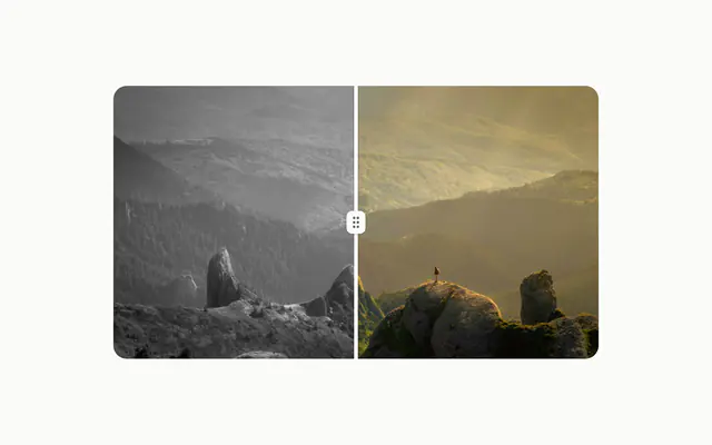
Pixel Image reveals a picture as a grid of pieces that fade in at scattered times, gray at first and then in color. The motion is CSS keyframes, with no animation library underneath. Use it once on a page, where the picture is the moment: a hero shot, a portfolio piece, an album cover.
A photo that only needs to load is a plain img, and a gallery of reveals mostly competes with itself.
Installation
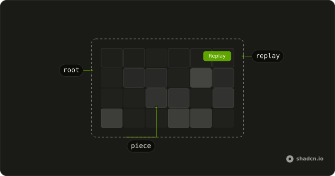
Anatomy
Usage
import { PixelImage } from "@/components/ui/pixel-image";<PixelImage
alt="Mountain peaks above a sea of clouds"
grid="6x4"
showReplayButton
src="/peaks.jpg"
/>Accessibility
Assistive tech gets the picture as one image: a wrapper with role="img" named by alt, while the pieces are copies of it with empty alt text. Write alt as you would for any img, saying what the picture shows. Under reduced motion there is no reveal: the picture shows at once, in color, and the Replay button is hidden, since there is nothing to replay. Elsewhere, Replay is a regular button with a visible label.
Demos
Grids
The same lake photo in three of the five named grids, columns by rows: 8x8 for a fine mosaic, 3x8 for wide, short pieces and 8x3 for tall, narrow ones. The other two are 6x4, the default, and 4x6. Each has its own Replay button, so you can play them side by side and pick the rhythm that suits your picture.
Colour
A misty forest in an 8 by 8 grid with grayscaleAnimation set to false, so the pieces arrive in color and the only motion is the fade. Use it when the gray step would fight the picture, such as a photo that is already muted, or a brand image that has to keep its colors from the first frame.
Custom grid
customGrid splits a 16:9 frame into 16 columns and 9 rows, and the timing is stretched for a slower reveal. Each piece fades in over 500ms (pixelFadeInDuration), the start times spread across 2.4 seconds (maxAnimationDelay), and color arrives at 2.6 seconds (colorRevealDelay). Pick it for a wide hero image that deserves a longer entrance.
FAQ
How many pieces should a Pixel Image use?
The default 6x4 makes 24 pieces and suits most pictures. 8x8 gives a finer mosaic of 64. On a square frame, 3x8 cuts the picture into wide, short pieces and 8x3 into tall, narrow ones, as the Grids demo shows.
customGrid takes any whole number of columns and rows from 1 to 16, so up to 256 pieces. A value outside that range is ignored and grid is used instead. Each piece is its own img with the same URL, so the file downloads once, but the browser paints, clips and fades every piece separately, so the work grows with the count.
How do I make the Pixel Image reveal faster or slower?
Three props set it, all in milliseconds. pixelFadeInDuration is how long each piece takes to fade in (1000 by default), maxAnimationDelay how long after the first piece the last one starts (1200), and colorRevealDelay when the gray turns to color (1300).
With the defaults the last piece is in place at about 2.2 seconds and the color finishes at 2.3, since the color change takes as long as one piece's fade. The Custom grid demo stretches all three.
Can I skip the gray step in a Pixel Image?
Set grayscaleAnimation to false, and the pieces arrive in full color, as in the Colour demo. The fade and the scattered order stay the same, and colorRevealDelay no longer does anything.
Keep the gray step for a picture whose color is the payoff, such as a sunset or a product shot.
How do people replay the Pixel Image animation in React?
Set showReplayButton to true, and a Replay button sits in the top-end corner of the picture. Pressing it plays the whole reveal again from an empty frame. It's hidden under reduced motion, where the picture shows at once.
There's no prop or method to replay it from your own code. Remounting the component plays the reveal again, as soon as its image is ready.
When does the Pixel Image reveal start?
When the image has loaded, so a slow connection doesn't play the reveal over an empty frame. An image the browser already has starts at once, and one that fails to load starts too, rather than waiting forever.
Until then the pieces are transparent, in the server-rendered HTML too, unless the visitor asks for reduced motion. The order of the pieces comes from their place in the grid, not from a random number, so the server and the browser render the same markup.
How do I change the size or shape of a Pixel Image?
Pass classes to it. It's square and up to 24rem wide by default, from aspect-square, w-full and max-w-96. The Custom grid demo uses aspect-video and max-w-xl for a wide frame.
The image covers whatever shape you give it, cropped at the edges like a background photo, so pick a grid whose cells match the shape: 16 by 9 for a 16:9 frame keeps every piece square.
Can I use Pixel Image with an image CDN or my framework's image component?
A CDN works: pass its URL as src. Your framework's image component doesn't, because every piece is a plain img with that URL, so the picture gets no resizing or format conversion from it.
Ask the CDN for the size you show instead, as the demos do with Unsplash URLs cropped to their frames, such as 800 pixels square. A full-size photo in a 24rem frame costs the same download whether it's revealed in pieces or not.
API Reference
PixelImage
<div> data-slot="pixel-image"
altstring
What the picture shows, for assistive tech. The pieces themselves are hidden from it.
srcstring
The image's URL.
colorRevealDelay?number
The delay before the pieces turn from grey to colour, in milliseconds.
- Default
1300
customGrid?object
Any grid from 1 × 1 to 16 × 16; it replaces grid when it's valid.
- Type
{ cols: number; rows: number }
grayscaleAnimation?boolean
Whether the pieces arrive grey and turn to colour once assembled.
- Default
true
grid?PixelImageGrid
The grid the picture splits into, columns × rows.
- Default
"6x4"
maxAnimationDelay?number
The spread of the pieces' start times, in milliseconds: the last piece starts this long after the first.
- Default
1200
pixelFadeInDuration?number
How long each piece takes to fade in, in milliseconds.
- Default
1000
showReplayButton?boolean
Whether a Replay button sits in the top-end corner. It's hidden under reduced motion, where the picture shows at once.
- Default
false
className?string
Merged with the part's classes.
data-run?string
Mirrors run.
--pixel-image-clipstring--pixel-image-color-delaystring
When the colour arrives (colorRevealDelay).
--pixel-image-durationstring
How long each piece fades in (pixelFadeInDuration).