shadcn.io is an independent project built on shadcn/ui
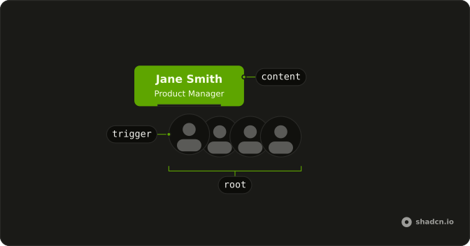
Animated Tooltip is a row of overlapping avatars. Point at one, or tab to it, and the person's name and role pop up above the photo, swinging toward the pointer as it moves across. Use it for a team section, a project's contributors or the reviewers on a pull request, where faces come first and names on demand.
To label a single icon button, use a Tooltip. For a card with a bio and links about one person, use a Hover Card.
Installation
Anatomy
Usage
import {
  AnimatedTooltip, type AnimatedTooltipItem,
} from "@/components/ui/animated-tooltip";
Each person needs an id that is unique in the row, a name and a designation. A photo in image and a link in href are optional.
const team: AnimatedTooltipItem[] = [
  {
    designation: "Software Engineer",
    id: 1,
    image: "https://github.com/shadcn.png",
    name: "John Doe",
  },
  {
    designation: "Product Manager",
    id: 2,
    name: "Jane Smith",
  },
];

<AnimatedTooltip items={team} />;
Accessibility
The row is a list, and each avatar is a button, or a link when the person has an href. Its name comes from the person's name through aria-labelledby and its description from their designation through aria-describedby, so a screen reader reads both whether or not the tooltip shows. The photo has an empty alt, since the avatar is already named. Pressing an avatar runs the item's onClick when there is one. Without an href or an onClick, the button is there only so keyboard users can reach the name. Escape hides the tooltip of the focused avatar, and of the avatar under the pointer wherever focus is.
- Tab
- Moves focus to the next avatar and shows its tooltip.
- Shift+Tab
- Moves focus to the previous avatar and shows its tooltip.
- Enter
- Follows the link of an avatar with an
href, or presses the button of one without, which runs the item'sonClick. - Space
- Presses the button of an avatar without an
href, which runs the item'sonClick. - Escape
- Hides the tooltip of the focused avatar, or of the avatar under the pointer, until focus or the pointer moves on.
Demos
Links
Four maintainers, each with an href, so every avatar is a link to a GitHub profile instead of a button, and a line under the row says so. The tooltip still names the person and gives a line about them. Use links when the row leads somewhere, such as a profile, an author page or a commit history.
Initials
Three reviewers on a pull request, beside a Reviewers label, with their review status as the role. Only the first has a photo, so the other two show the first letters of their name. Keep a label next to the row, as here, so it reads as a list of people before anyone hovers.
Swing
The same three crew members twice, labeled Calm and Lively. The calm row sets --animated-tooltip-sway to 4px and --animated-tooltip-tilt to 4deg, and the lively one sets both to 24, against defaults of 14px and 12deg. Set them with a class on AnimatedTooltip, and keep the swing small where people read the names often.
FAQ
What data does Animated Tooltip take?
An items array, rendered in order, each item overlapping the one before. Every item has an id, a name and a designation, the tooltip's two lines, plus an optional image URL, an optional href and an optional onClick.
The id is the item's key, so keep it unique in the row. Any string or number works, spaces included. Without a photo, the avatar shows the first letter of the first two words of name.
Does Animated Tooltip show on keyboard focus in React?
Yes. Each avatar is a button, or a link when the item has an href, so Tab reaches it, and the tooltip shows while it has keyboard focus, the same way it shows on hover. A mouse click that focuses an avatar doesn't count as keyboard focus.
Escape hides the tooltip of the focused avatar, and of the avatar under the pointer even while focus is elsewhere, until focus or the pointer moves on. The tooltip itself never takes the pointer, so moving onto it ends the hover.
How does the Animated Tooltip swing toward the pointer?
While the pointer moves over an avatar, the item writes one CSS variable, --animated-tooltip-x, from -1 at its left edge to 1 at its right. The tooltip turns by that share of --animated-tooltip-tilt and slides by that share of --animated-tooltip-sway, and an easing curve that overshoots makes it swing past and settle.
Nothing re-renders as the pointer moves. Set the two variables with a class on AnimatedTooltip to calm it down or liven it up, as in the Swing demo. Touch input doesn't move it.
What does Animated Tooltip do when someone prefers reduced motion?
The tooltip only fades in and out. It doesn't rise, grow, turn or slide, and the avatar under the pointer doesn't lift. The component sets --animated-tooltip-motion to 0 under motion-reduce, which zeroes every movement while keeping the fade.
The names, the roles and the way the tooltip opens and closes stay the same, on hover, on focus and with Escape.
How do I change the avatar size in Animated Tooltip?
Edit components/ui/animated-tooltip, which is yours once installed. Each avatar is an Avatar with size-12, 48 pixels, and a ring in the page's background color, and each item after the first is pulled 12 pixels over the one before by -ms-3. The avatar appears twice in the file, once for links and once for buttons, so change both, and scale the overlap with the size.
The initials show while a photo loads and stay if it fails.
How do I make Animated Tooltip avatars open a page with my router?
Give the item an href, and its avatar becomes a link with the same tooltip, as in the Links demo. The component renders a plain a, so an internal path loads the whole page again instead of going through your router.
To use your router's link component, swap that a in components/ui/animated-tooltip for it and keep the classes and attributes. For an action other than following a link, such as opening the person's profile in a dialog, give the item an onClick, which runs when the avatar is pressed.
When should I use Tooltip instead of Animated Tooltip?
Use Tooltip to label one control, such as an icon button, where the label should sit beside it and move to stay on screen. Animated Tooltip is a whole row of people, with the label drawn above each avatar.
It doesn't flip or shift near an edge, so leave room above the row: the demos keep 80 pixels of padding there. A parent with overflow-hidden cuts the tooltip off.
API Reference
AnimatedTooltip
<ul> data-slot="animated-tooltip"
itemsAnimatedTooltipItem[]
The people in the row, in order.
className?string
Merged with the part's classes.
data-dismissed?string--animated-tooltip-liftstring--animated-tooltip-scalestring--animated-tooltip-swaystring
How far it slides at an edge (14px).
--animated-tooltip-tiltstring
How far it rotates at an edge (12deg).