shadcn.io is an independent project built on shadcn/ui
Installation
The command adds the example above to components/charts/ and, the first time, the chart kit to components/ui/charts/. Both are source files in your project from then on: read them, change them, delete what you don't use.
Usage
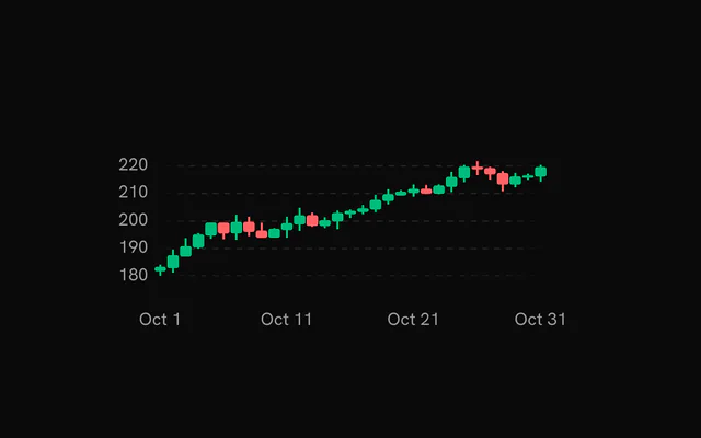
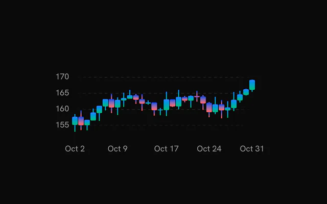
Each row is one period: a Date under date and its open, high, low and close. A candle that closed at or above its open counts as up.
<script setup lang="ts">
import {
  Candlestick,
  CandlestickChart,
  ChartTooltip,
  Grid,
  type OHLCDataPoint,
  XAxis,
  YAxis,
} from "@/components/ui/charts";

const data: OHLCDataPoint[] = [
  { close: 142.1, date: new Date(2026, 9, 5), high: 143.4, low: 139.8, open: 140.2 },
  { close: 141.3, date: new Date(2026, 9, 6), high: 142.9, low: 140.6, open: 142.1 },
  { close: 144.8, date: new Date(2026, 9, 7), high: 145.2, low: 141.0, open: 141.3 },
  { close: 143.9, date: new Date(2026, 9, 8), high: 146.1, low: 143.2, open: 144.8 },
  { close: 146.5, date: new Date(2026, 9, 9), high: 147.0, low: 143.5, open: 143.9 },
];
</script>

<template>
  <CandlestickChart ariaLabel="ACME, daily, October 2026" :data="data">
    <Grid horizontal />
    <Candlestick />
    <XAxis />
    <YAxis />
    <ChartTooltip />
  </CandlestickChart>
</template>
Anatomy
One Candlestick draws every row. The grid, the axes and the tooltip are the same parts the line chart uses.
<CandlestickChart :data="data">
  <Grid horizontal />
  <Candlestick />
  <XAxis />
  <YAxis />
  <ChartTooltip />
</CandlestickChart>CandlestickChart: Holds the rows, spaces the candles and fits the price axis to the wicks.Grid: Guide lines behind the candles.Candlestick: The candles: a body from open to close and a wick from low to high.XAxis: Date labels along the bottom.YAxis: Price labels.ChartTooltip: The crosshair, the date pill and the hovered candle's prices.
Up and down colors
Rising candles use --chart-positive and falling ones --chart-negative. Pass positiveFill and negativeFill for your own, a token or a url(#id) gradient defined inside the chart.
Candles size themselves to the spacing, leaving a candleGap of 20% of each slot. :candleWidth="18" fixes them at 18 px instead.
Zooming to a range
Pass xDomain as a start and end date and the chart plots only the candles inside it, with the price axis refitted to them. Buttons or a select that set it make a range picker.
The example also passes xDomainSlotCount, the number of days in view, so the first and last candles keep half a slot of room at the edges.
Hover
While a candle is hovered the others fade to fadedOpacity (0.3). Set :showHoverFade="false" to keep them at full strength.
:showDots="false" on the tooltip drops the dot on the close, leaving the crosshair and the date pill.
Patterned bodies
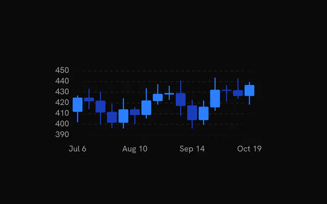
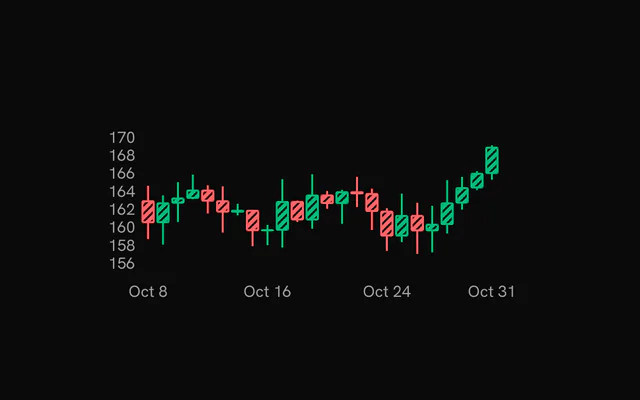
bodyPatternPositive and bodyPatternNegative lay a pattern over the bodies. Define a pattern inside the chart with an id, as the example does with PatternLines, and pass url(#id). insideStrokeWidth frames each body in its own color so the stripes keep an edge.
Candles only
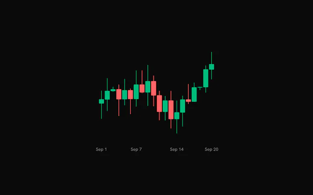
Leave out the Grid and the YAxis for a chart that's only candles and dates. A style height, such as :style="{ height: 320 }", replaces the 2:1 aspect ratio when the chart sits in a fixed slot.
With volume
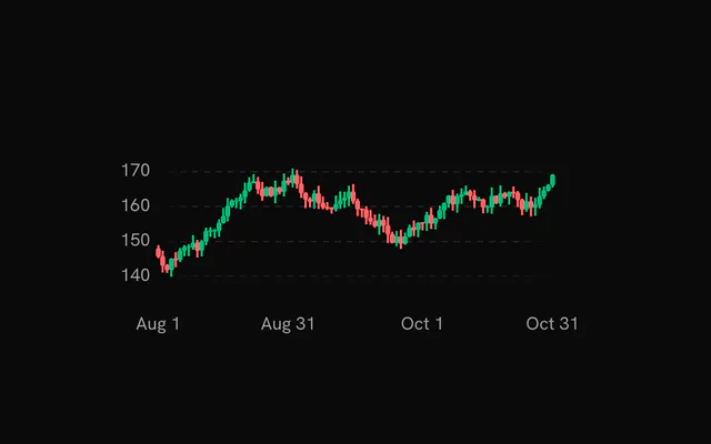
For volume under the price, or a moving average over it, put a Candlestick in a ComposedChart. There it draws on its own scale, which fits the wicks while the volume bars keep a zero baseline.
Customization
The kit is in your project, in components/ui/charts/: your framework's components over a shared core/. Change a default there and every chart picks it up.
class goes on the chart's container, so size and spacing are utility classes.
Without rows, the panel shows the close alone. Pass rows to list all four prices, formatted the way your market quotes them.
On this chart indicatorColor can also be a function of the hovered row, which is how the crosshair turns green or red with the candle under it.
<ChartTooltip
  :indicator-color="(point) =>
    Number(point.close) >= Number(point.open)
      ? 'var(--chart-positive)'
      : 'var(--chart-negative)'"
  :rows="(point) => [
    { color: 'var(--chart-1)', label: 'Open', value: Number(point.open).toFixed(2) },
    { color: 'var(--chart-1)', label: 'High', value: Number(point.high).toFixed(2) },
    { color: 'var(--chart-1)', label: 'Low', value: Number(point.low).toFixed(2) },
    { color: 'var(--chart-1)', label: 'Close', value: Number(point.close).toFixed(2) },
  ]"
/>
Where a part renders content of its own, you pass it in. In Vue:
ChartTooltip:<template #content="{ point, index }">
Loading state
The candlestick chart has no loading state. While the prices load, a <BarChartLoading /> with the same aspectRatio holds the space and reads close enough to a row of candles.
Animation
Candles grow out from their middle, body and wick together, one after another from the left, within animationDuration (1100 ms). enterTransition takes a spring or a tween with its duration in seconds.
:animate="false" on the Candlestick draws them in place. Reduced motion skips the entrance.
Theming
Every color in the kit is one of your theme's tokens or a mix of them, except --chart-positive, a fixed green. A preset or the .dark class restyles the chart, and overriding a token in your CSS changes it everywhere.
--chart-positive is a fixed green and --chart-negative follows your --destructive. Override either in your CSS to recolor every candlestick, or set the fills per chart.
| Token | Default | Paints |
|---|---|---|
--chart-positive | a fixed green | values above the baseline in profit and loss |
--chart-negative | --destructive | values below the baseline in profit and loss |
--chart-grid | --border | grid lines |
--chart-label | --muted-foreground | tick labels |
--chart-crosshair | --muted-foreground at 75% | the hover line |
--chart-tooltip-background | --popover | the tooltip panel |
--chart-date-pill-background | --primary | the date pill on hover |
:root {
  --chart-grid: var(--muted);
  --chart-label: var(--foreground);
}
Accessibility
The chart is announced as an image named by ariaLabel ("Candlestick chart" by default). Name the symbol and the period there.
The tooltip is a polite live region. Here its text is the candle's date and four prices, so a screen reader hears them as the focus moves.
- Tab
- Moves focus to the chart.
- Arrow Right
- Moves to the next candle. ArrowDown does the same.
- Arrow Left
- Moves to the previous candle. ArrowUp does the same.
- Home
- Jumps to the first candle.
- End
- Jumps to the last candle.
API reference
Vue takes the same props as React, in camelCase or kebab-case, with class for className. Render props are scoped slots (#content), and callbacks such as onHoverChange can be written as listeners (@hover-change).
CandlestickChart
dataOHLCDataPoint[]
The candles to plot, one row per period.
xDataKey?string
Key of the time value in each row. The value must be a Date or something new Date() accepts.
- Default
"date"
margin?Partial<ChartMargin>
Space around the plot area in pixels. Missing sides use the default.
- Type
Partial<ChartMargin>- Default
{ top: 40, right: 40, bottom: 40, left: 40 }
animationDuration?number
Duration of the entrance in milliseconds.
- Default
1100
enterTransition?EnterTransition
Customizes the entrance: a spring, or a cubic-bezier tween with a duration in seconds. See EnterTransition.
revealSignature?string
Changing this string replays the entrance animation.
aspectRatio?string
CSS aspect ratio of the chart, as "width / height".
- Default
"2 / 1"
class?string
Extra CSS class name for the chart container.
style?CSSProperties
Inline styles for the chart container. aspectRatio: "unset" or an explicit height makes the chart fill the container height.
candleGap?number
Gap between candle slots as a fraction of the slot width (0-1). Ignored when candleWidth is set. A gap below the default cannot widen candles past 80% of their spacing.
- Default
0.2
candleWidth?number
Fixed candle body width in px. When unset, candles size to the spacing between them.
xDomain?[Date, Date]
Visible x range as [start, end], used for brush zoom. The chart plots only this range of data.
xDomainSlotCount?number
Length of the full dataset while xDomain zooms into part of it. It keeps candle spacing consistent with the unzoomed chart.
childrenReactNode
The layers to draw: Candlestick, Grid, XAxis, YAxis, ChartTooltip and the other chart children.
ariaLabel?string
Accessible name of the chart.
- Default
"Candlestick chart"
ariaDescription?string
Longer accessible description of the chart, exposed as aria-description.
Candlestick
animate?boolean
Animate the candles in on entrance.
- Default
true
positiveFill?string
Fill color of candles that closed at or above their open.
- Default
"var(--chart-positive)"
negativeFill?string
Fill color of candles that closed below their open.
- Default
"var(--chart-negative)"
bodyPatternPositive?string
A fill (url(#pattern-id) of a pattern child) laid over the body of the candles that closed at or above their open. Their body and wick then take the solid --chart-positive color under it.
bodyPatternNegative?string
A fill (url(#pattern-id)) laid over the body of the candles that closed below their open, on the solid --chart-negative color.
insideStrokeWidth?number
Width in px of a frame drawn just inside each body, in the body's color: it outlines a pattern overlay.
- Default
0
fadedOpacity?number
Opacity of the candles that are not hovered while another candle is hovered.
- Default
0.3
showHoverFade?boolean
Dim the candles that are not hovered.
- Default
true
yAxisId?string | number
Inside a ComposedChart: the y scale the candles are drawn on. Its domain floats around the wicks instead of starting at zero, so volume bars on another axis keep their zero baseline. CandlestickChart has one price axis.
- Type
string | number- Default
"left"
widthRatio?number
Inside a ComposedChart: body width as a fraction of the slot between two x values (0.05 to 1). CandlestickChart sizes candles with candleGap / candleWidth.
- Default
0.6
Grid
horizontal?boolean
Show horizontal grid lines.
- Default
true
vertical?boolean
Show vertical grid lines.
- Default
false
numTicksRows?number
Number of horizontal grid lines. Ignored when rowTickValues is set.
- Default
5
numTicksColumns?number
Number of vertical grid lines.
- Default
10
rowTickValues?number[]
Explicit y values for the horizontal grid lines. Overrides numTicksRows.
stroke?string
Color of the grid lines.
- Default
"var(--chart-grid)"
loadingStroke?string
Grid color while the chart is loading. Falls back to stroke.
strokeOpacity?number
Opacity of the grid lines.
- Default
1
strokeWidth?number
Width of the grid lines in px.
- Default
1
strokeDasharray?string
Dash pattern of the grid lines.
- Default
"4,4"
highlightRowValues?number[]
Y values of horizontal lines drawn with the highlight styling, for example a zero baseline.
highlightRowStroke?string
Color of the highlighted rows.
- Default
"var(--chart-foreground-muted)"
highlightRowStrokeOpacity?number
Opacity of the highlighted rows.
- Default
1
highlightRowStrokeWidth?number
Width of the highlighted rows in px.
- Default
1
highlightRowStrokeDasharray?string
Dash pattern of the highlighted rows.
- Default
"0"
fadeHorizontal?boolean
Fade the horizontal lines toward transparent at the left and right edges.
- Default
true
fadeVertical?boolean
Fade the vertical lines toward transparent at the top and bottom edges.
- Default
false
hideHorizontalEdgeLines?boolean
Drop the first and last horizontal line (kept when two or fewer remain).
- Default
false
hideVerticalEdgeLines?boolean
Drop the first and last vertical line (kept when two or fewer remain).
- Default
false
shimmer?boolean
While the chart is loading, sweep a bright band across the grid.
- Default
false
shimmerStroke?string
Color of the shimmer band.
- Default
"color-mix(in oklch, var(--bkm-foreground) 68%, transparent)"
shimmerSpeed?number
Speed multiplier of the shimmer sweep. 2 is twice as fast.
- Default
1
XAxis
numTicks?number | ResponsiveChartLabelCount
Target number of tick labels along the x axis, or one per chart width: { base, sm, md, lg, xl } takes the count of the widest breakpoint the chart reaches (640, 768, 1024 and 1280 px).
- Type
number | ResponsiveChartLabelCount- Default
5
labels?readonly string[]
The tick text of each data row, in row order: it replaces the date formatting (pair it with ChartTooltip dateLabels).
tickerHalfWidth?number
Half-width in px of the zone around the date pill inside which tick labels are hidden. Line, area and composed charts widen it to the pill's half-width plus the widest tick label's, so no label sits half under the pill.
- Default
50
tickMode?"domain" | "data"
Where ticks fall: "data" places them on evenly spaced data rows, "domain" places them at evenly spaced time values across the x domain.
- Type
"domain" | "data"- Default
"data"
formatValue?(value: Readonly<Date>) => string
Formats a tick date into its label. Defaults to a short month and day such as "Jan 5".
- Type
(value: Readonly<Date>) => string
YAxis
yAxisId?string | number
Id of the y scale this axis labels. Must match the yAxisId of the series that use it.
- Type
string | number- Default
"left"
orientation?"left" | "right"
Side of the plot the axis sits on. The primary axis is on the left; additional axes default to the right.
- Type
"left" | "right"- Default
"left"
numTicks?number
Target number of tick labels. The primary axis also sets the number of horizontal grid lines.
- Default
5
formatLargeNumbers?boolean
Abbreviate values of 1000 and above as thousands, with one decimal where needed, for example 2k or 1.5k.
- Default
true
formatValue?(value: number) => string
Formats a tick value into its label. Overrides formatLargeNumbers.
- Type
(value: number) => string
ChartTooltip
showDatePill?boolean
Show the date pill that rides along the bottom of the plot.
- Default
true
showCrosshair?boolean
Show the vertical crosshair line. Bar charts leave it off unless this is true (the dots and the category pill mark the bar).
- Default
true
showDots?boolean
Show a dot on every series at the hovered position.
- Default
true
dotVariant?"dot" | "ring"
Dot style: a filled "dot" or a transparent "ring" square. Read by BarChart only.
- Type
"dot" | "ring"- Default
"dot"
dotSize?number
Dot radius in px.
- Default
5
dotRadiusFraction?number
Corner radius of the "ring" variant as a fraction of its side (0 is square, 0.5 is a circle). Read by BarChart only.
- Default
0.25
dotScale?number
Multiplier applied to the dot or ring size. Read by BarChart and LiveLineChart.
- Default
1
dotStrokeWidth?number
Stroke width of the dots in px.
- Default
2
indicatorColor?string | ((point: Record<string, unknown>) => string)
Color of the crosshair. Only a string is applied; the function form that bklit-ui accepts is ignored and the default is used.
- Type
string | ((point: Record<string, unknown>) => string)- Default
"var(--chart-crosshair)"
#content?slot: { point, index }
Replaces the default tooltip panel body. Receives the hovered data row and its index; with pinnable, also whether the panel is pinned and a dismiss that unpins it (for a close button in a pinned panel's detail).
pinnable?boolean
A click (or Enter, or Space) on the chart pins the tooltip where it is: the panel takes the pointer, so its content can grow into detail and hold controls, until another click, Escape or dismiss lets it go.
- Default
false
rows?(point: Record<string, unknown>) => { readonly color: string; readonly label: string; readonly value: string | number }[]
Replaces the default rows (one per series) with your own list of { color, label, value }.
- Type
(point: Record<string, unknown>) => { readonly color: string; readonly label: string; readonly value: string | number }[]
dotColor?string | ((point: Record<string, unknown>, line: ChartLineConfig) => string)
Fill of the tooltip dots. A function receives the hovered row and the series config, and is called again each time the hovered row changes. Defaults to each series' color; a ProfitLossLine's dot takes the color of the hovered value's sign.
- Type
string | ((point: Record<string, unknown>, line: ChartLineConfig) => string)
#default?slot
Extra content rendered below the rows in the default panel, for example marker details. Without it, a chart with ChartMarkers lists the markers on the hovered date there.
class?string
Extra class name for the tooltip panel.
springConfig?SpringConfig
Spring for the floating panel when matchCrosshair is on. Defaults to the chart's tooltip spring.
matchCrosshair?boolean
Make the floating panel follow the pointer with the same spring as the crosshair instead of damping.
- Default
false
damping?number
Spring damping for the floating panel when matchCrosshair is off, on bklit's 0 to 100 scale: lower is bouncier, higher slower, 0 moves the panel instantly. The default, 20, is the snappy hover spring (stiffness 3600, damping 120); every other value is bklit's spring for it played six times faster.
- Default
20
indicatorDasharray?string
Dash pattern of the crosshair. Omit for a solid line.
indicatorFadeEdges?IndicatorFadeEdges
Vertical fade of the crosshair: both ends, the top, the bottom, or none (solid).
- Default
"both"
indicatorFadeLength?number
Size of the crosshair's fade, as a percentage of its height (2 to 40).
- Default
10
indicatorEndColor?string
Bottom colour of the crosshair: it ramps from indicatorColor at the top to this at the bottom (composes with the fade).
indicatorEnd?"plot" | "point"
How far down the crosshair reaches: the whole plot, or down to the hovered point of the first series.
- Type
"plot" | "point"- Default
"plot"
dotHaloBlur?number
Blur in px on the dots' halo, for a soft glow.
- Default
0
topOffset?number
Extra gap in px between the top of the plot and the tooltip panel.
- Default
0
dateLabels?readonly string[]
The date pill's text for each data row, in row order (pair it with XAxis labels).
boxSpringConfig?SpringConfig
Spring for the floating panel. Takes priority over matchCrosshair and damping.
indicatorWidth?IndicatorWidth
Thickness of the crosshair: a width in px, or "line" (1px), "thin" (2px), "medium" (4px) or "thick" (8px).
- Default
"line"
Examples
6 examples on Vue, each live with its code and its own install command.