shadcn.io is an independent project built on shadcn/ui
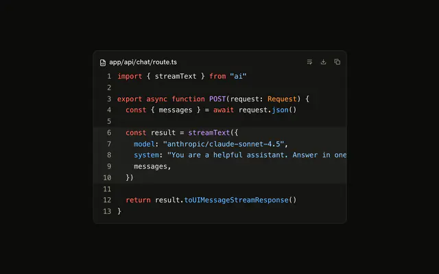
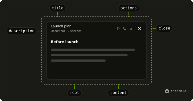
Artifact is the panel that holds what the model made, a file of code, a plan or a draft, apart from the conversation about it. A header carries the title, a line under it and a row of icon actions such as copy and download, and the content below scrolls on its own.
Reach for it when the answer is something to keep rather than a reply. For a snippet that belongs inside a message, a Code Block on its own is enough.
Installation
Anatomy
Usage
import { CopyIcon } from "lucide-react";
import {
  Artifact, ArtifactAction, ArtifactActions, ArtifactContent,
  ArtifactDescription, ArtifactHeader, ArtifactTitle,
} from "@/components/ui/artifact";
Wrap the title and the description in one element. The header lays its children out in a row with the space between them, so the pair stays together at the start and the actions sit at the end.
<Artifact className="max-w-md">
  <ArtifactHeader>
    <div>
      <ArtifactTitle>Launch plan</ArtifactTitle>
      <ArtifactDescription>Updated 1 minute ago</ArtifactDescription>
    </div>
    <ArtifactActions>
      <ArtifactAction icon={CopyIcon} tooltip="Copy to clipboard" />
    </ArtifactActions>
  </ArtifactHeader>
  <ArtifactContent>
    The beta opens to the waitlist on Monday, in three waves a day apart.
  </ArtifactContent>
</Artifact>
Accessibility
Artifact has no role and ArtifactTitle is a paragraph, so a screen reader reads the panel as more of the page. When it opens beside the chat as an area of its own, give the root the region role with an aria-labelledby pointing at the title's id, and give the title the heading role and an aria-level. Each ArtifactAction is a button named by its label, or else its tooltip, which opens on keyboard focus as well as hover. An icon with neither has no name. ArtifactClose is named Close unless its children are text, which then name it.
- Tab
- Moves focus to the next action or close button in the header.
- Shift+Tab
- Moves focus to the previous action.
- Enter
- Presses the focused action.
- Space
- Presses the focused action.
- Escape
- Closes the tooltip of the focused action.
Demos
Document
A launch plan written out with a heading, two subheadings and two lists, under two actions that work. Copy puts the Markdown on the clipboard and shows a check for two seconds, with the tooltip and the button's name changing to Copied, and Download saves it as a Markdown file. ArtifactContent adds padding and scrolling but no type styles, so the document sets its own headings and spacing.
Streaming
A TypeScript hook in a Code Block, complete when the demo loads. Press Replay and it writes itself again four characters at a time, the way tokens arrive, while the description reads Writing and every action stays disabled until the file is whole, so Copy and Download only ever hand over all of it. The description is a polite live region, so a screen reader hears writing start and end.
Close
A chat whose reply has a Release notes button that opens the notes beside it, or below it on a narrow screen. ArtifactClose only renders the button, so the demo keeps open in state, removes the panel on close and moves focus back to Release notes. Without that last step, focus would go with the panel and drop to the page's body.
AI SDK
A model writes an artifact through a tool, writeDocument in this example, whose input is the title and the content. That input streams in while the model writes it, so render the latest call as it stands and say it's still writing while its state is input-streaming.
const { messages } = useChat();

const document = messages
  .flatMap((message) => message.parts)
  .filter((part) => part.type === "tool-writeDocument")
  .at(-1);

if (!document?.input) {
  return null;
}

return (
  <Artifact className="h-96">
    <ArtifactHeader>
      <div>
        <ArtifactTitle>{document.input.title}</ArtifactTitle>
        <ArtifactDescription>
          {document.state === "input-streaming" ? "Writing…" : "Document"}
        </ArtifactDescription>
      </div>
    </ArtifactHeader>
    <ArtifactContent>{document.input.content}</ArtifactContent>
  </Artifact>
);
Code goes in a Code Block inside ArtifactContent, as in the Streaming demo, and Markdown goes through your Markdown renderer.
Migrating from AI SDK Elements
If you added Artifact from AI SDK Elements (opens in a new tab), your project has components/ai-elements/artifact.tsx. Install this one, change the imports to @/components/ui/artifact and delete the old file. Every part keeps its name, and tooltip, label and icon on ArtifactAction mean what they did. What changes:
ArtifactActionandArtifactCloseareicon-smButtons, where AI SDK Elements usedsmButtons shrunk with classes.- Their name is an
aria-labelrather than a hidden span. An action takes it fromlabel, thentooltip. ArtifactClosekeeps the name Close when you pass an icon as its children, as AI SDK Elements did. Text children name it instead.
Each ArtifactAction with a tooltip still brings its own TooltipProvider, as the AI SDK Elements one does, so it works without one higher up.
FAQ
What can I put inside an Artifact?
Anything that fits in a scrolling box. Code reads best in a Code Block with the content's padding removed, so the lines run edge to edge, as the first demo on this page shows. A document is your own headings, paragraphs and lists, or whatever your Markdown renderer produces.
A page the model built can sit in a Web Preview inside the content, which gives it its own address bar and frame.
How do I make the Artifact's content scroll?
Give the Artifact a height, a fixed one or the full height of the column it sits in. The header keeps its own size, and ArtifactContent takes the rest and scrolls inside it.
Without a height, the panel grows with whatever is in it and the page scrolls instead. If you size it to fill its parent, that parent needs a height of its own for the fill to mean anything.
How do I add copy and download buttons to an Artifact?
Put an ArtifactAction in ArtifactActions for each one, with a lucide icon as icon, a tooltip that names it and your handler in onClick. The Document demo copies with the clipboard API and downloads through a Blob and a temporary link.
After a copy, swap the icon for a check and the tooltip for Copied for a couple of seconds, as that demo does. The button's name changes with the tooltip, so the confirmation isn't only visual.
How do I close an Artifact panel and open it again?
Keep whether it's open in state next to the chat, render the Artifact only while it's open, and set that state to closed from ArtifactClose. The button itself is an × named Close and changes nothing on its own.
Leave a way back, such as a button on the message that made it, and move focus to that button when the panel closes. Otherwise focus goes with the panel and drops to the page's body, and keyboard and screen reader users have to find their place again. The Close demo does both.
Can the Artifact show content while the model is still writing it?
It can, since nothing in the Artifact waits for the end. Render whatever has arrived and it grows as tokens come in. Say that it's still writing in ArtifactDescription, and disable the actions until it's done, because a copy halfway through hands over half a file.
The Streaming demo works this way and makes the description a polite live region, so a screen reader hears when writing starts and stops.
How do I show the Artifact next to the chat?
Put the message list and the Artifact side by side in a flex row, give the Artifact a width, and let it take the row's height so its content scrolls under a header that stays put. On a narrow screen, stack the two. The Close demo switches from a column to a row at the small breakpoint.
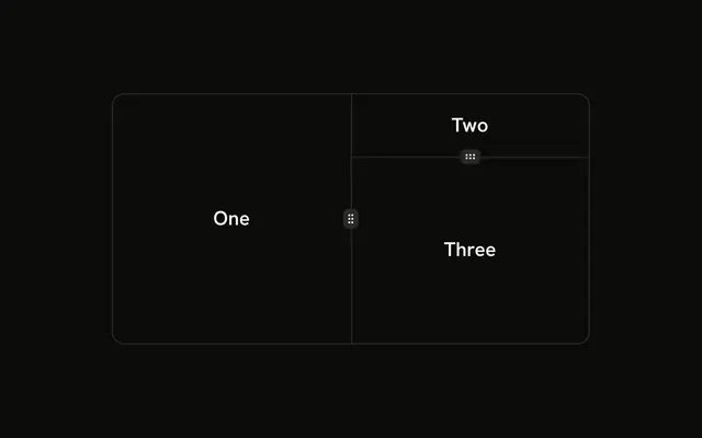
For a panel people can widen by dragging, place both in a Resizable group. Instead of stacking on a phone, you can open the Artifact in a Sheet that slides over the chat and closes back to it.
When should I use an Artifact instead of a Code Block in the message?
Use an Artifact when the answer is a thing people keep and work with, such as a file, a plan or a draft, and it's long enough to need a title, actions and room of its own. The chat then says what was made in one line, and the result lives in the panel.
A Code Block inside the message fits a short snippet that belongs to the explanation around it. For a page the model built that people should click through, use a Web Preview.
API Reference
Artifact
<div> data-slot="artifact"
className?string
Merged with the part's classes.
ArtifactHeader
<div> data-slot="artifact-header"
className?string
Merged with the part's classes.
ArtifactTitle
<p> data-slot="artifact-title"
className?string
Merged with the part's classes.
ArtifactDescription
<p> data-slot="artifact-description"
className?string
Merged with the part's classes.
ArtifactActions
<div> data-slot="artifact-actions"
className?string
Merged with the part's classes.
ArtifactAction
data-slot="artifact-action"
clickEffect?boolean
Apply a click effect to the button.
- Default
true
icon?LucideIcon
The icon it shows, in place of children: a lucide icon component.
isLoading?boolean
Show a loading indicator.
- Default
false
label?string
Its accessible name, when it isn't the tooltip's text.
- Default
tooltip
tooltip?string
Shown on hover and focus, and its accessible name without label.
asChild?boolean
Merge props onto the child element instead of rendering a host.
className?string
Merged with the part's classes.
ArtifactClose
data-slot="artifact-close"
clickEffect?boolean
Apply a click effect to the button.
- Default
true
isLoading?boolean
Show a loading indicator.
- Default
false
asChild?boolean
Merge props onto the child element instead of rendering a host.
className?string
Merged with the part's classes.
ArtifactContent
<div> data-slot="artifact-content"
className?string
Merged with the part's classes.